

A self-initiated project to add a new feature giving users the ability to customize their dashboard.
Mint
Role: Product Designer
Dates: October-November 2022 (50hrs)
Team: Amanda Walker
Tools: Figma, Whimsical, Maze, Google Meet, Miro
Introduction
Mint (also known as Intuit Mint) is a personal budgeting and finance website and mobile app for the US and Canada. Mint was founded in 2006 by Aaron Patzer and acquired by Intuit in 2009. It was created as a way to allow users to track bank, credit card, investment and loan balances as well as spending transactions. It also created a way for users to set budgets and financial goals. It currently has over 20 million users.
Problem
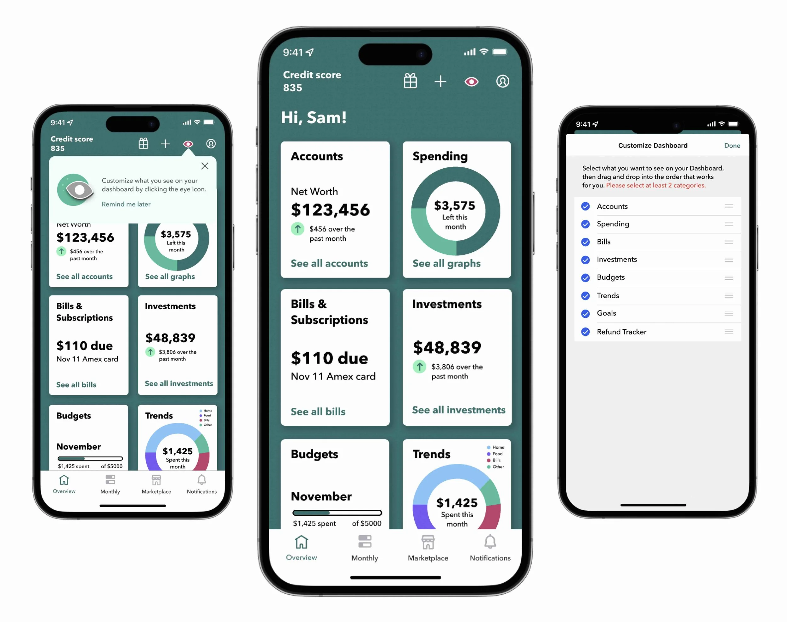
Mint users see a lot of information when they arrive on the Overview screen (as pictured). This is a problem because users may only want to view some of this information. Searching for what they want to see is time-consuming and could lead to a decrease in app usage.
Research
Competitive Analysis
First, I created a competitor analysis in order to learn about direct and non direct competitors in the industry. I also put together a feature chart in order to see a direct comparison between the companies. Next, I developed some provisional personas. This assisted in starting to think about what types of potential clients would be interacting with Mint’s app.


User interviews
Speaking with real Mint users helped tremendously in order to determine key motivations and frustrations when using the app. The key takeaway from my interviews was that customers value different types of information in Mint. Whatever the categories are, how do we make it super easy for them to see what they want to see?

User persona
Since the information I gathered in my user interviews was so vast, I found it would be the most helpful to develop two different types of user personas. Meet Sam and Bill!
-Sam lives with his girlfriend and they share expenses. He wants to be able to see what he is spending his money on each month and doesn’t want to miss paying off his credit card.
-Bill is married with kids. He wants to pay bills on time, but also wants to track spending so that he has enough money saved for his family.


Define
Sitemap
For the next phase of the project, I determined based on my user feedback, that I needed to design an overview screen/dashboard that allows users to customize the categories they see based on what is important to them.
The structure for my sitemap changed various times over the course of testing my wireframes.


Task flows and User flows
Keeping Sam and Bill in mind, I created a task flow where Sam could log into Mint and personalize what he wants to see on the overview screen. I also created a user flow in which Sam logs in to Mint and included the different paths he could take in order to customize the dashboard so that it includes all the categories he wants.


Design
Sketches
Incorporating the user flow, first I sketched ideas for how the wireframes would look.

Wireframes
Next, I digitized the wireframes in Figma. This stage required multiple rounds of testing in order to create a design where the user could successfully complete the task. The below images show the multiple versions that were tested before applying UI elements.

Test 1:
For this test, users were unsuccessfully able to complete the task of clicking on the filter icon to access the overview settings screen. Also, if they clicked on the profile icon, they didn’t know that you would click the overview settings section to be taken to the overview settings screen.

Test 2:
From the results from Test 1, I changed the filter icon to a gear icon. This proved much more successful and users were able to access the overview settings screen and successfully deactivate unneeded categories. There was some confusion around if the gear icon was just for overview settings or settings in general.

Test 3:
As a result of some confusion around purpose of the gear icon, I did a complete redesign where the user would click on individual categories. This would display a pop up where they could disable the individual category from view. Although the testing was successful, the flow would stray too far from how Mint is currently structured.
Conclusion:
Ultimately, because the wireframes from Test 2 were overall successful for completing the task and stayed within the structure of the existing app, I decided to proceed with this design for implementing UI elements.
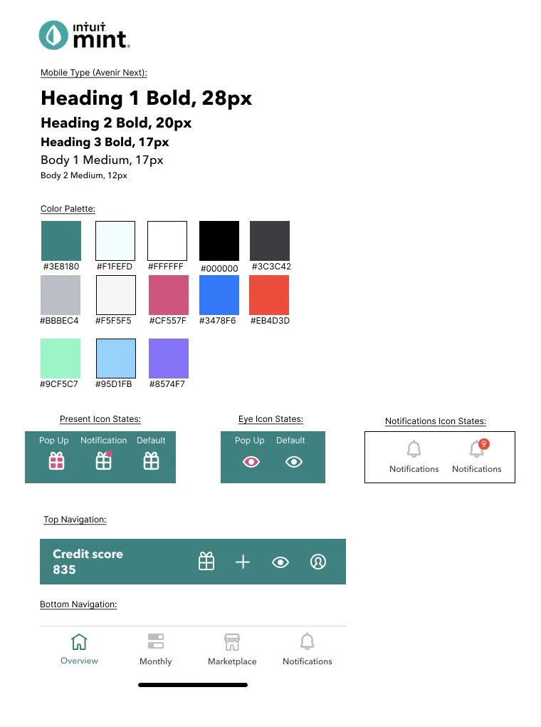
UI Kit
Expanding upon Mint’s pre-existing design system including font, color and bottom navigation, I added additional elements that would be used for the new feature.

Prototyping
In preparation for usability testing, I implemented the elements from my UI kit and made adjustments to my wireframes based on the feedback from my initial testing, in order to create a mid-fidelity prototype.

Test
Usability Testing
Participants:
4 Google Meet interviews, female, ages 25-40


Objectives:
Test overall look and ease of use moving through the app
Test how easy it is for a user to change the overview settings to fit their preference.
Observe any areas that the user finds difficult or frustrating
Goals & Needs:
Users have varying categories they find important
Need a way to see information that is important for the “day-to-day”
Frustrations:
Confusion between plus and gear icons
Assumed there would be a general settings screen before overview settings
Confused with budget layout
Couldn’t tell difference between trends and spending
Key Motivators:
Dashboard needs be “easy and intuitive”
User don’t like having too much on one screen
Having a customized dashboard is a “plus”
Iterations
After gathering feedback from my usability testing, and making a priority list for revisions, I made these changes to my prototype:

Icon and Tool Tip Problems
Users expressed confusion with the gear icon. Although they were able to successfully access the customize view settings, it was assumed that the gear was related to general settings. I chose to change the icon to an eye to make it more intuitive that it would be used for view settings. Additionally, I added 'remind me later' text, so that if a user chose not read the tool tip, they could read it in the future.
Category Comprehension
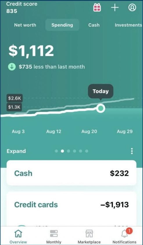
Users expressed confusion related to what was being presented on some of the category cards. For Trends, users were unsure of the difference between this and Spending. I chose to add a color coded key to Trends so that users knew that this card would show a breakdown of spending by category. For Investments, users didn't find much value in the ticker prices. As a result, I changed the card to show how their money was directly effected, so that they know how much they've gained/lost over the month. Finally, for Budgets, users weren't sure if the original design showed what amount had been spent or what left, so I added text so it is more comprehensive.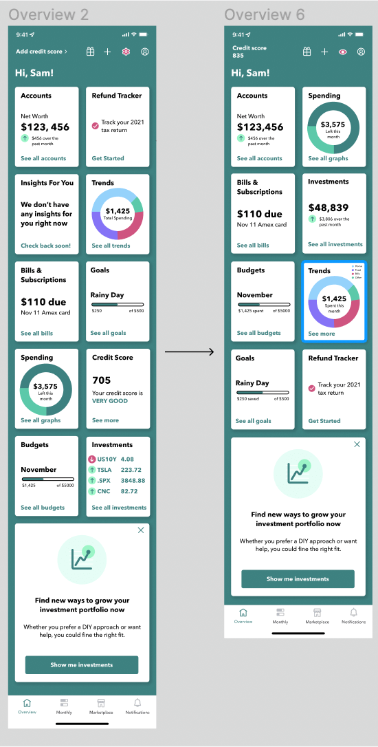

Card Hierarchy Issue
During testing, I asked users specifically about what categories they found the most valuable and what they would like to see on their customized dashboard. From these conversations, I was able to establish a better hierarchy and remove cards that were redundant.
Minimal Category Selection Problem
During testing, it became apparent that there was no guidance for developers if a user chose to select an uneven amount of categories or if none of the categories were checked. I decided to give the user a two selection rule as a minimum. I also designed a placeholder card for the uneven space on the overview screen. The user now has the option to click on this card if they would like to select another category. By clicking, they will be taken back to the Customize Dashboard screen.Prototype
In conclusion
Through an iterative design process, I was able to add a customized dashboard feature to Mint’s pre-existing app that provides users the ability to see the most valuable aspects of their finances front and center. They are now able to see this information easily, and it gives them the power to change their dashboard to fit their individual needs. Working within the scope of the project, I designed the essential screens for this feature. With additional time, I would like to test the updated version of the prototype, and develop additional screens for each category card.